
When people think of a website accessibility audit, they often picture lawsuits, government regulations, or a long technical checklist. Those things certainly exist, and for many businesses and organizations the legal requirements are reason enough to take accessibility seriously. But compliance is only part of the story.
At its core, accessibility is about removing barriers. Someone navigating with a keyboard instead of a mouse. Someone using a screen reader because they’re blind. Someone with low vision who needs stronger color contrast. Someone with limited motor control. Someone recovering from an injury who temporarily can’t use one hand.
These aren’t “edge cases” that we ”have to” design around reluctantly. They’re real issues faced by real people trying to use the same internet as everyone else.
But there’s a useful side-effect to this work: many of the things that make a website more accessible also make it a better website.
- clear hierarchy
- readable text
- sensible navigation
- descriptive links
- clean HTML
- predictable controls
These things benefit every user. Earlier this year, I completed a website accessibility audit and remediation project for a client. I can’t share the organization itself, but I can share the process because it’s a useful example of how I approach this kind of work.
Start with a website accessibility audit
The first step isn’t changing code. It’s finding out where the problems are.
For this project, I used Google’s Lighthouse accessibility audit as the primary benchmark. Lighthouse checks a page against a range of accessibility criteria and produces a score out of 100, along with specific issues that need attention.
I also checked pages using WAVE, the free Web Accessibility Evaluation Tool from WebAIM. WAVE is particularly useful because it overlays warnings and errors directly onto the page, making it super easy to see where problems occur in context.
Using more than one tool matters. Automated accessibility testing is very handy, but no automated scanner can tell you conclusively that a website is accessible. Some problems require human judgment, and some aspects of usability need to be tested by actually navigating the interface.
An automated website accessibility audit is a good diagnostic tool, but not a certificate of accessibility.
Fix the foundation before fixing individual pages
This is where understanding how websites are actually built becomes important. If I find the same accessibility problem on 20 pages, I don’t want to fix it 20 times. I want to find out what is generating the problem.
Most WordPress websites are assembled from shared components:
- theme templates
- headers
- footers
- navigation systems
- content templates
- buttons
- forms
- plugin output
- reusable blocks
An accessibility problem in one of those components can propagate across much of the website.
So I start at the template level.
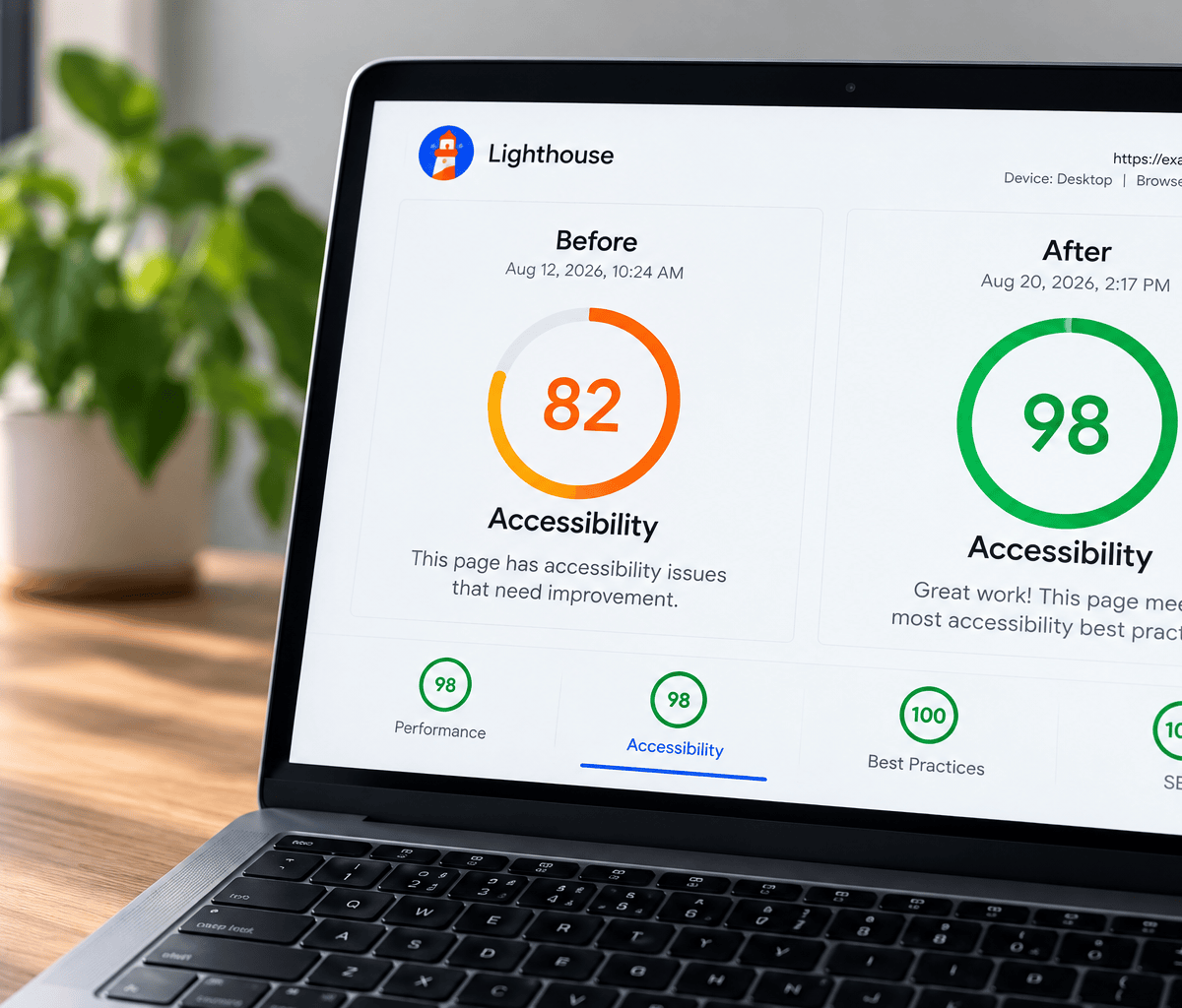
On this particular project, the homepage initially received a Lighthouse accessibility score of 82/100. I found and corrected multiple issues in the underlying theme and shared components. Those changes improved accessibility across the site before I began working through individual pages.
The homepage score rose from 82 to 95.
That’s the leverage you get from working from the outside in: fix the system first, then deal with the exceptions.
Then work through the site page by page
Once the underlying templates are in good shape, I start auditing individual pages.
This is slower work, but it’s where you find the anomalies that aren’t coming from the theme itself: a missing page heading, an old link, an unusual content layout, a plugin that generates questionable markup, or a page assembled differently from the rest of the site.
In this project, that process uncovered several recurring issues.
Build a proper document structure
One of the most common problems I encounter is incorrect heading hierarchy.
Headings aren’t just large pieces of text. <h1>, <h2>, <h3> and the other HTML heading elements describe the structure of a document. Assistive technologies use that structure to help someone understand a page and move around it efficiently. Of course, a well-structured document is always clearer to all our brains.
As a practical convention, I build pages around one clear <h1> that identifies the primary subject of the page, followed by <h2> headings for major sections and <h3> headings for subsections where needed. People sometimes skip this hierarchy because they want a different looking heading — a classic example of style being prioritized over function.
Several pages in this project were missing an <h1> entirely. Others jumped from <h1> directly to <h3>, creating an illogical hierarchy.
Visually, nothing may appear wrong. A designer can make an <h3> look exactly like an <h2> with CSS. Semantically, however, they are not the same thing. Accessibility depends on the underlying structure, not merely what the page looks like.
This is one reason a website accessibility audit often involves looking underneath the design.
Clean up broken or questionable HTML
During the audit I corrected heading structures, repaired outdated internal links, fixed layout inconsistencies and resolved HTML issues flagged by the testing tools. I also found links that were still pointing to an old development version of the website and searched the site for any other remnants of those URLs.
That last problem wasn’t strictly an accessibility issue, but this is another benefit of a thorough audit: when you examine a site systematically, you tend to find other things that need attention.
Most of these fixes didn’t dramatically change how the website looked. They improved what was happening underneath it.
Color contrast matters more than you think
Another common accessibility problem is insufficient color contrast.
Light gray text on white might look elegant on a designer’s monitor, but it can be difficult or impossible for someone with impaired vision to read. We designers can be a touch precious sometimes! The same applies to text placed over photographs, subtle button states and brand colors that simply don’t provide enough contrast when used together.
Accessibility standards provide measurable contrast ratios rather than leaving this entirely to taste. That means some design decisions occasionally have to change.
This doesn’t mean accessible websites need to be visually ugly, stark, or stripped of personality. It means color has to do an actual job as well as look good.
Check links, navigation and keyboard access
A website also needs to work for someone who isn’t navigating it the way you are.
I checked that interactive controls were keyboard focusable, that focus moved through the page in a logical order, and that users could enter and leave interactive regions without becoming trapped. I also verified that the visual order of the page corresponded sensibly with the underlying document order.
The site was already making good use of HTML5 landmark elements such as <main> and <nav>, which help assistive technologies understand the major regions of a page. Custom interactive controls also had appropriate ARIA information where required.
Links deserve attention too. Accessibility tools can flag empty links, unclear link text and other patterns that may make sense visually but provide little context to someone navigating by assistive technology.
Some alerts require judgment rather than blindly following whatever the scanner says. An accessibility tool is telling you that something deserves inspection. It isn’t necessarily telling you exactly how the website should be designed.
Plugins can create accessibility problems too
WordPress adds another layer to the process because not all of the HTML on a WordPress site comes from the theme or page content. Plugins can sometimes generate messy markup.
On this site, for example, a directory plugin generated a heading structure that wasn’t ideal. The free version of the plugin didn’t provide a way to change the HTML wrapper responsible for it. That left a small accessibility warning on otherwise excellent pages.
This is an important distinction. Before you can decide how to fix a problem, you need to figure out if it’s coming from the content, the theme, a plugin, or an external service.
Sometimes the correct answer is to modify the code. Sometimes it’s to change a setting. Sometimes upgrading or replacing a plugin makes more sense.
And sometimes the correct answer is: leave it alone.
Know when to stop chasing 100
A perfect automated accessibility score isn’t always possible, and chasing one for its own sake can be a counterproductive time-sink.
Many websites include third-party services such as PayPal donation buttons, Google Translate, maps, appointment systems, video players or embedded forms. These services can inject their own HTML into your page.
You don’t control that HTML.
In this project, for example, an embedded PayPal donation button was responsible for one of the remaining Lighthouse issues on the homepage. Google Translate also introduced accessibility warnings through code generated by the service itself.
There was no responsible theme-level fix I could make with either because the problematic markup wasn’t coming from the theme or the website itself.
You can remove or replace a third-party service if the accessibility problem is serious enough to justify it. But otherwise, a Lighthouse score of 98/100 may genuinely be as good as that page can reasonably get.
That’s not an excuse to ignore problems you can fix. But we can accept a limitation without pretending it doesn’t exist. The goal is improved accessibility, not scorekeeping.
Small improvements add up
By the end of this project, nearly every important page on the site was scoring between 98 and 100, with many reaching a perfect Lighthouse accessibility score after relatively small structural fixes.
One page moved from 98 to 100 simply by adding the missing <h1>. Another reached 100 after correcting non-sequential heading tags. Other pages needed small layout or markup corrections.
The remaining recommendations were comparatively minor: removing unnecessary social-sharing components, simplifying a few navigation behaviors and eliminating interface elements that added little value while introducing additional code and accessibility warnings.
That’s fairly representative of this kind of work. A good website accessibility audit rarely means one magic fix. It’s the cumulative result of finding and removing dozens of small barriers.
A score isn’t the end of the job
There’s another reason I don’t regard a 100 Lighthouse score as the finish line: websites change.
Someone publishes a new page. A plugin gets replaced. A new form is added. Brand colors change. An embedded service updates its code. A perfectly clean site can gradually accumulate accessibility problems again.
Accessibility is better treated as part of website maintenance than as a one-time certification exercise.
For organizations with more demanding accessibility requirements, there are also more comprehensive testing and monitoring services available. The appropriate level of testing depends on the website, its audience, its legal obligations and its budget.
But even a relatively modest audit can uncover a surprising number of fixable barriers.
Making the web a little better
There are legal reasons to care about website accessibility. There are business reasons too. An inaccessible website can exclude potential customers, donors, patients, employees, members or constituents.
But here’s a simpler reason: the web should work for as many people as we can reasonably make it work for.
Good accessibility work is mostly careful web design and development: clean structure, thoughtful choices, good code, appropriate testing, and a willingness to look at a website from perspectives other than our own.
Every barrier we remove makes one small part of the internet easier for someone else to use. That seems like work worth doing.
Your website accessibility audit
Concerned about the accessibility of your website?
I can audit what you have, identify what’s fixable, and work through the improvements systematically.
Get in touch here to chat about your site.